Often, when we’re speaking with newcomers about their job search or networking in Canada, we talk about building your personal brand: It’s who you are, it’s what you do, it’s what you stand for. This of course comes from the marketing world and the term “brand,” which can be described as the combination of product attributes, service, or experience.
At Arrive, our goal is to help newcomers achieve their life, career and financial goals in Canada.
We make it easier for newcomers to receive the information and assistance they need for a smoother transition to Canada by providing dynamic tools, resources, and a unique ability to build and connect with a curated network. We’re there to help every step of the way.
We needed that to be expressed in our brand identity or brand design across all of our touchpoints, so we engaged the Strategic Design group at RBC Ventures. The iconic maple leaf shape made up of multicoloured arrows conveying both the journey, diversity, and distinct cultures that come together to make up Canada is exactly what we were looking for. We are so excited and proud to unveil the culmination of their efforts and thought you might like a glimpse into the design journey and how our logo landed in such a special place.
We chatted with a few of the people responsible, and here’s what they had to say:
Hector: It starts with finding that emotional connection with your audience. How do you connect in a way that aligns the brand’s core values with those of the user. At a foundational level, who are you, what do you deliver and how does that connect with the people you are serving?
Off the top of your head, think of those brands that you connect with. It’s usually because they first deliver really great value, but then it also might speak to who you are, where you’re trying to go, or the person you’re trying to be. Then there’s a connection beyond the service a brand provides.
Madison: Arrive has a very strong understanding of their users, which made my job easy.
So, when I say strong understanding, I mean that they know the journey that their user takes because most members of the team are newcomers themselves and have made the same journey.
I would say that provided certain insights that we might not have had if the Arrive team didn’t have such a deep knowledge and relationship with their users — for example, understanding the challenges of leaving everything behind and moving to Canada. We really wanted the brand to acknowledge that experience and be more welcoming than anything else.
I firmly believe that to resonate with your user, it starts with your product or service and making sure that your value proposition is actually a benefit to that user. For Arrive, this is definitely true. What I’ve learned over the years from my mentors is that the best brands are really brands that reflect the core insights and values of your user, like Arrive does.
Peter: So we take the strategy – the brand backbone – what the brand is looking for in terms of what the brand wants to be, how the brand wants to be seen, the tone of voice, all that kind of stuff and we begin to design.
Jessica: Design can be so many things: Icon, logo, typography, color palette, and photography. But also the main thing, especially with Arrive – is just trying to think about who the user is and how these designs best speak to them directly – I think we have a more direct relationship with the Arrive user.
Peter: When I design a brand or when I design a logo – when I design anything really – I want to design it to be as simple as possible, so that the user will see it straight on – simple, yet beautiful.
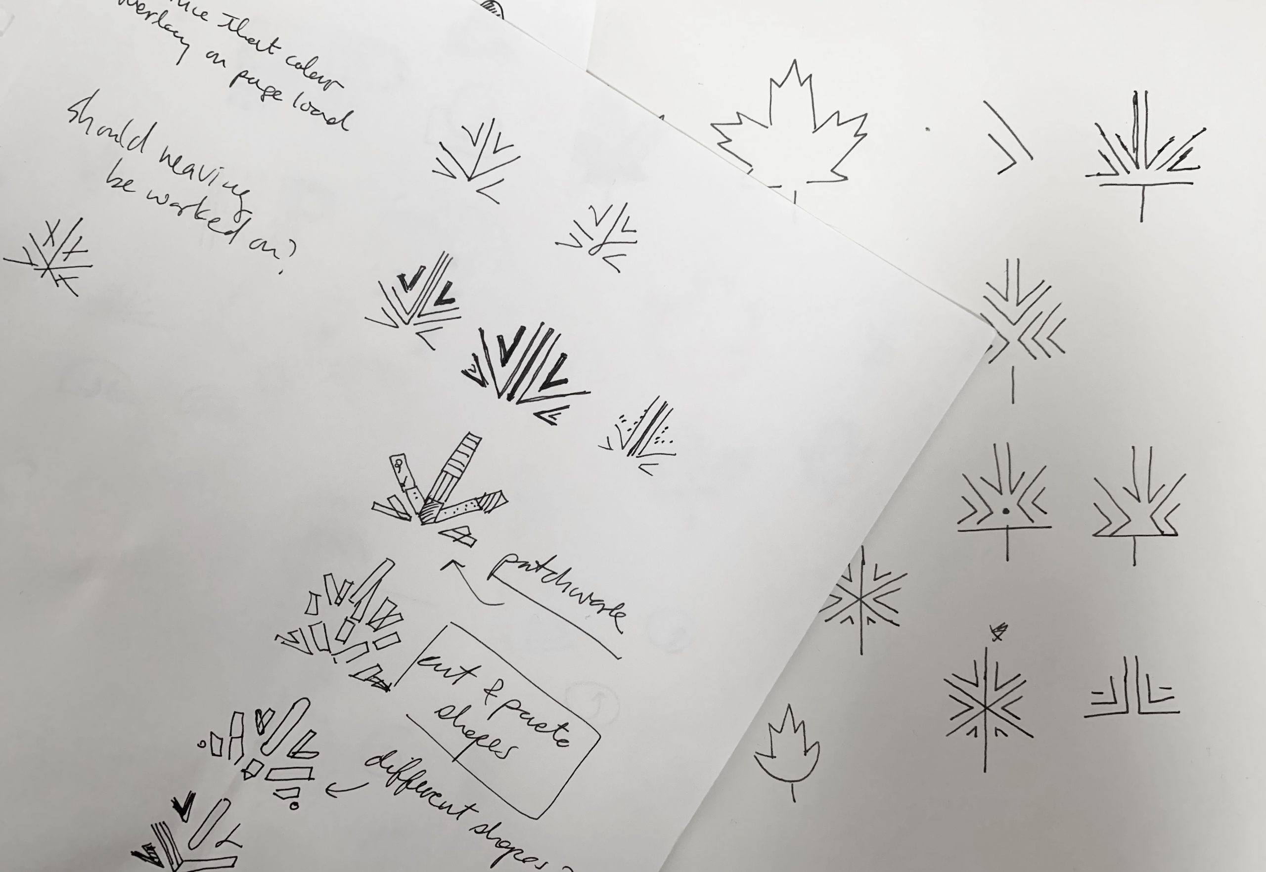
Jessica: I start with sketching out ideas. I sketch out many of them, some of them I elaborate on further. When I try to go all the way, I start to cut back and say, “Well, how much can you do over it and still retain the elements?”
Peter:I I start by building digital sketches.
I think we did hundreds of sketches.
Jessica: Really?
Peter: Yeah. I think so, no?
OK, maybe a hundred.
Jessica: I’d say, like thirty.
Peter: No, I did like fifty alone.
Jessica: Ok, between seventy-five and a hundred.
If I do a sketch and there’s something about it that I like, then I’ll do an iteration of that and continue – by the end, it’s kind of clear.
Peter: It came down to the maple leaf and the arrows that were kind of coming in to one point.
Jessica: We really liked that idea of combining the two.
Peter: The logo had to be welcoming: That came from the colours. I’m an immigrant myself, so this project meant a lot to me. One thing that really spoke to me was instead of making the maple leaf red – make it the colours of the world. That was really interesting – that was fun!
Jessica: When people think of Canada, they think about how inclusive, diverse and welcoming we are.
Peter: The openness and the welcoming aspect also came from the typeface and the weight of the typeface. I think we used the light version of Unica.
Jessica: We used the regular version.
Peter: Right.
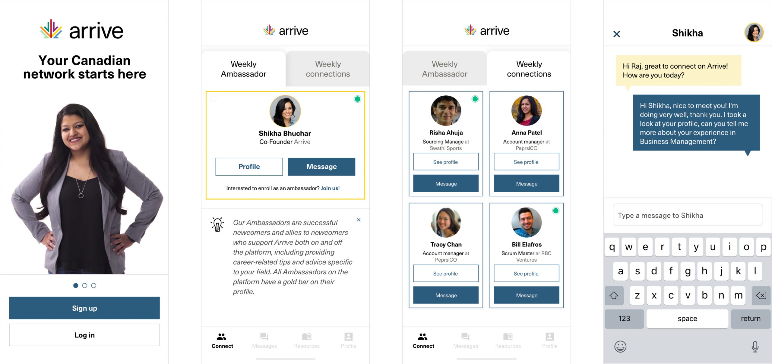
Quentin: As lead product designer at Arrive, I’m taking the new brand and rebranding all our assets, products and platforms, like the Arrive mobile app.
Hector: For us, this was a unique opportunity. The folks at Arrive care about what they’re doing. They’re deeply committed to the success of their venture and they have a product that brings real value to its users. When you feel a connection yourself, you lean in and you give it as much as you can to try to make something truly special.